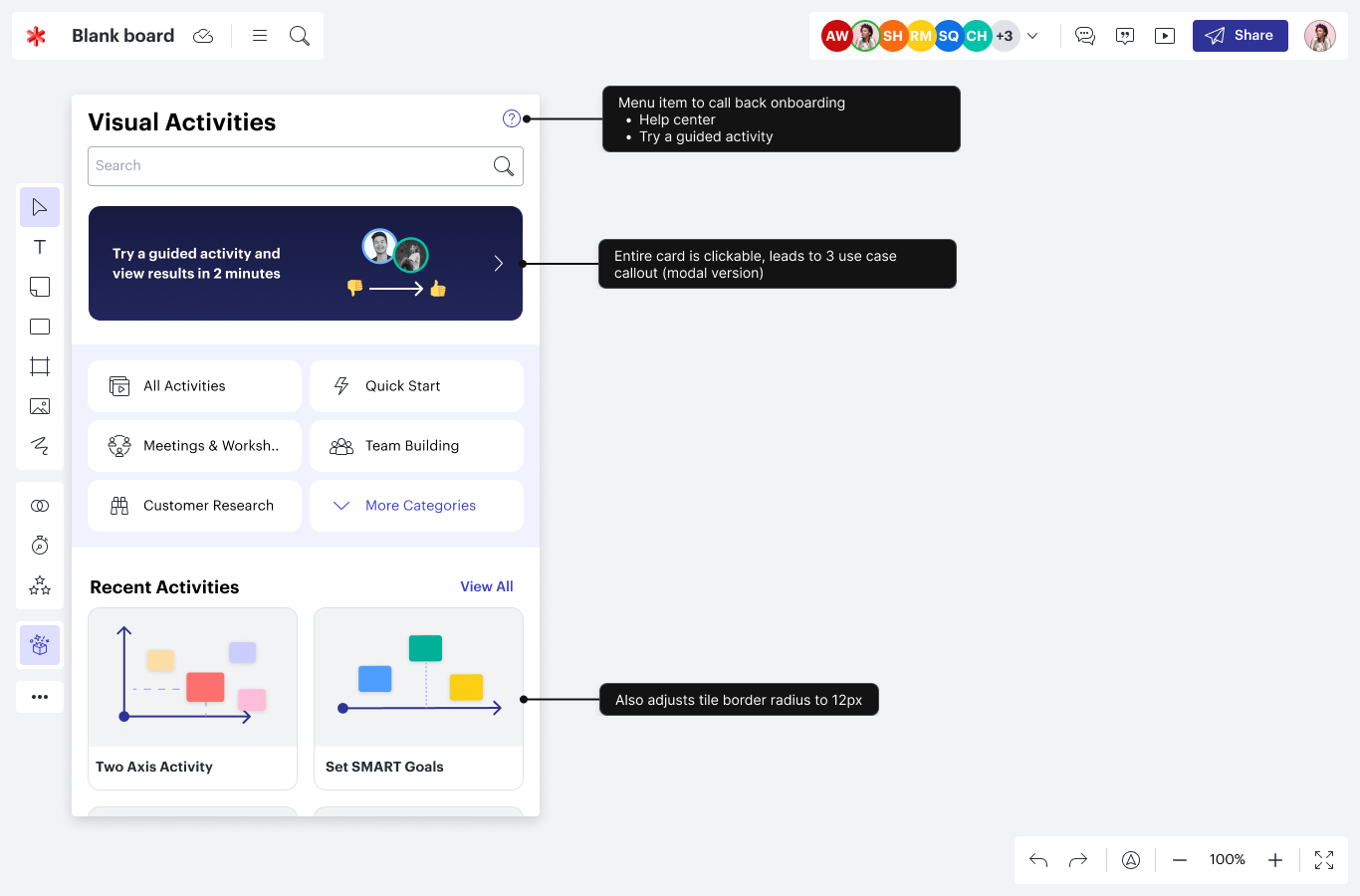
Visual Activities
Brief
Researched and designed a new canvas-based survey tool during my time at Lucid Software.
Team
Design - Vishaka Nirmal, Saurabh Phadnis, Casey Robinson
Product - Cole Rosenberg, Preston Hunter, Adam Ellsworth
Toolkit
User research, product strategy, experience design, UI design, data visualization, prototype usability testing
Problem space
In a virtual whiteboard, everyone can collaborate easily, by moving stickies, shapes, and cards around.
But not everyone does contribute. We heard from existing Lucid customers that they wanted to encourage feedback while making group decisions.
This year-long project resulted in the on-canvas survey tool, allowing teams to gather individual feedback in a visual manner.
My role
At Lucid, I was one of three designers on the team for this project. I had the opportunity to take on the role of Design Lead for significant pieces of this work, including the:
- Participant experience of taking a visual activity
- Interactive data visualization views of activity results
- Onboarding for new users of activities
The following case study highlights my individual research and design work, with support from my various team members.

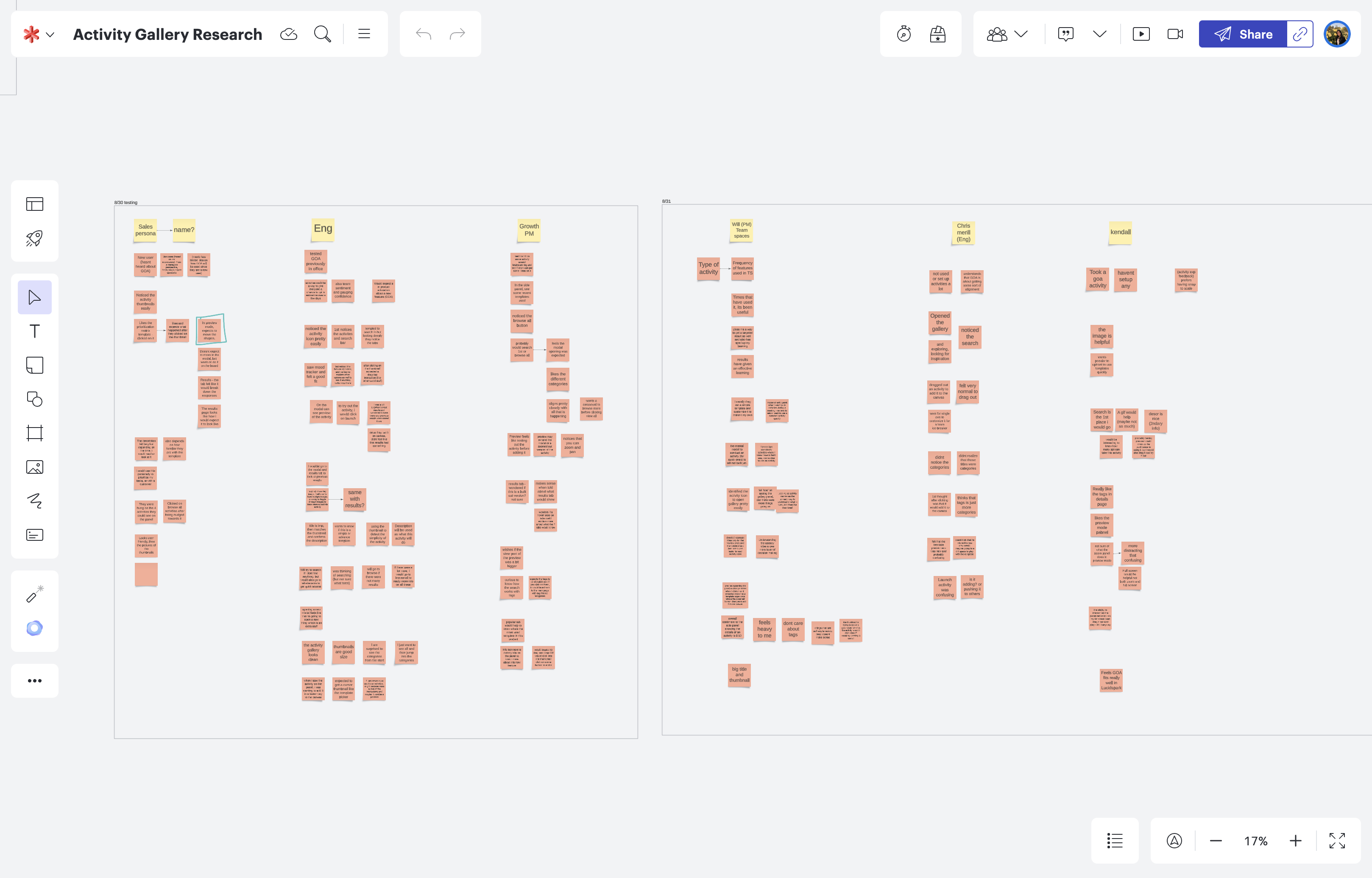
Research
Throughout this project, I hosted continuous learning sessions with over 100 active Lucid suite users under an NDA to learn about their workflows. I often kept track of my notes on a Lucidspark whiteboard, seen here.
These research sessions were often semi-structured or observational interviews, focused on the question:
How might we build a tool to encourage feedback on a virtual canvas?
 Interview insight
From hosting these user interviews, I learned that teams wanted to gather feedback on existing content on their board. As a team, they would decide on Jira card estimates or create a priority list of their brainstormed sticky note ideas.
Ideation
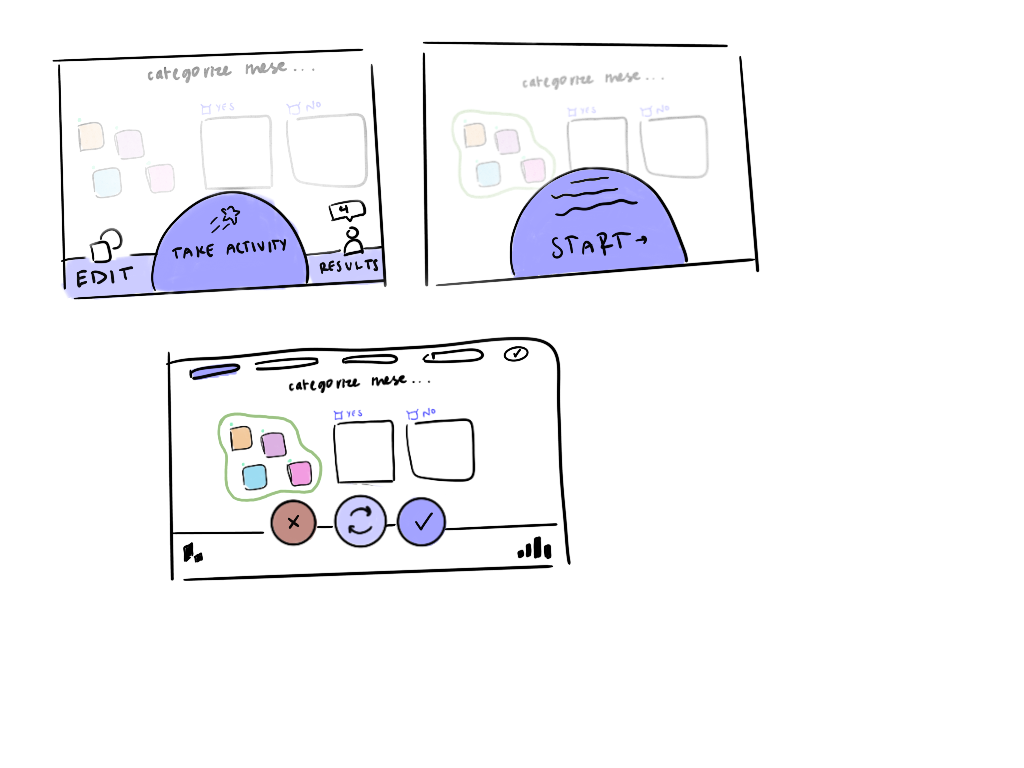
With continuous inspiration from user interviews, I often created conceptual, vision-oriented sketches to take back to the team.
Our user interviews showed that teams wanted to use on-canvas content. I created some early sketches for an on-canvas survey shape concept. In my sketches, I strive to keep a good balance between portraying a concept clearly and not being too prescriptive about UI.
Co-designing session
As we narrowed in on a survey experience, one of my key projects was to design what visual survey results would look like.
To gather a wide range of ideas, I hosted a design jam with the 20 UX designers across our product teams. Over a 2 hour session, I led the design team through recent research and data visualization best practices. I then asked them to ideate, and you can see some of the quick thoughts here.
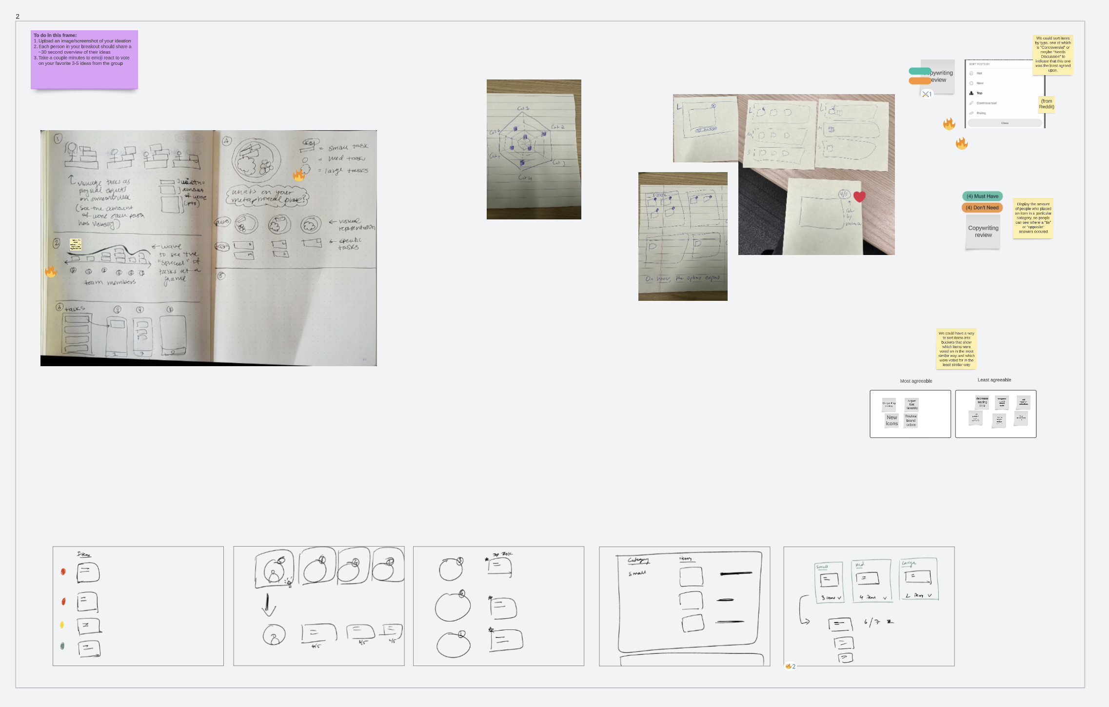
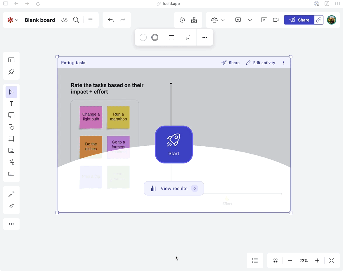
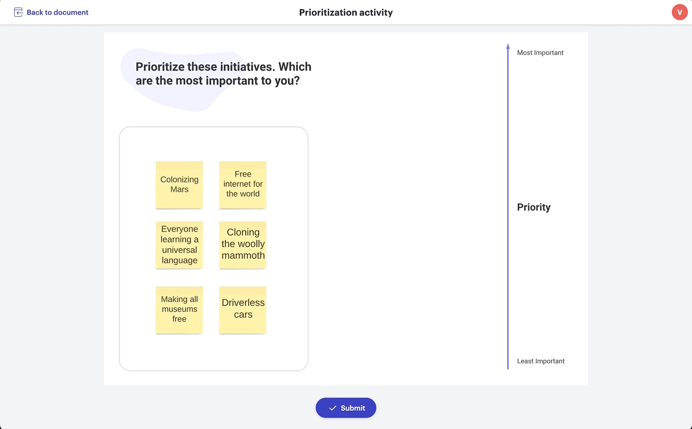
Interaction user testing
Creating a visual survey meant we were breaking a lot of paradigms. Instead of a Likert scale with a pre-defined scale and discrete values, we wanted the experience to feel freeform.
Here, you can see an early version of our working prototype, where the freeform participation allows each person to move content onto a 'data-recording' axis.
To test these interactions, we often took our prototype throughout the company, asking those in marketing, HR, or customer education to test this experience.
Interaction insight
During interaction testing, we saw that users were familiar with a collaborative space on the canvas, as they witnessed in Lucidspark and Lucidchart. As they played with our survey prototype, they were unsure whether other collaborators would be able to see or edit their response.
User flow testing
Apart from general interaction testing, I ran specific user flow tests with non-Lucid users. One of the specific epics I led focused on the usability of the visual survey results.
I ran 4 sets of tests on the UserTesting platform, testing out Figma prototypes for results. In total, we received feedback from 40 users.
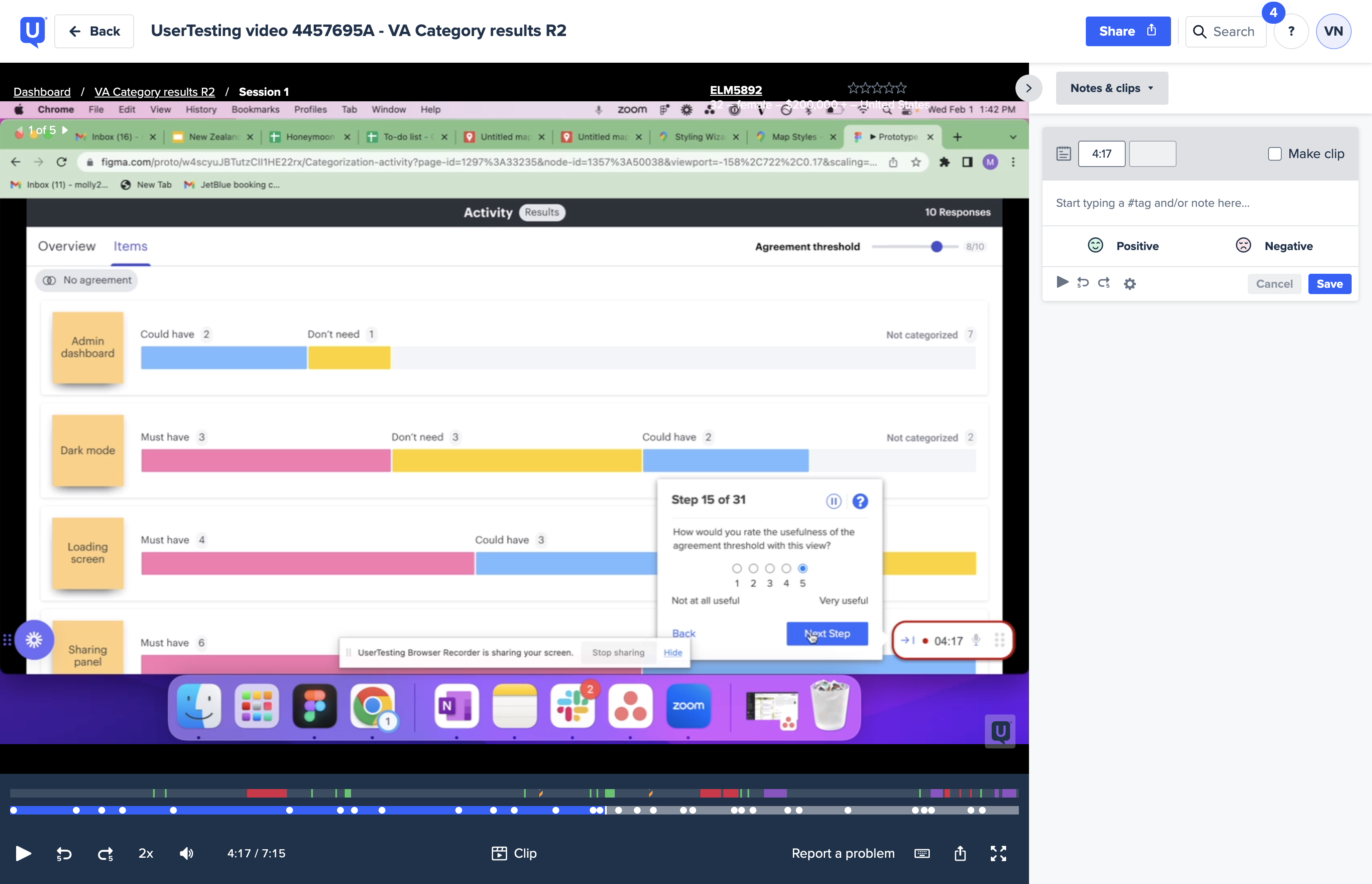
User flow insight
In this testing, I saw that participants wanted to see a digestible visual of all user responses. With a simple visual, they would be able to make quick team decisions.
Final designs
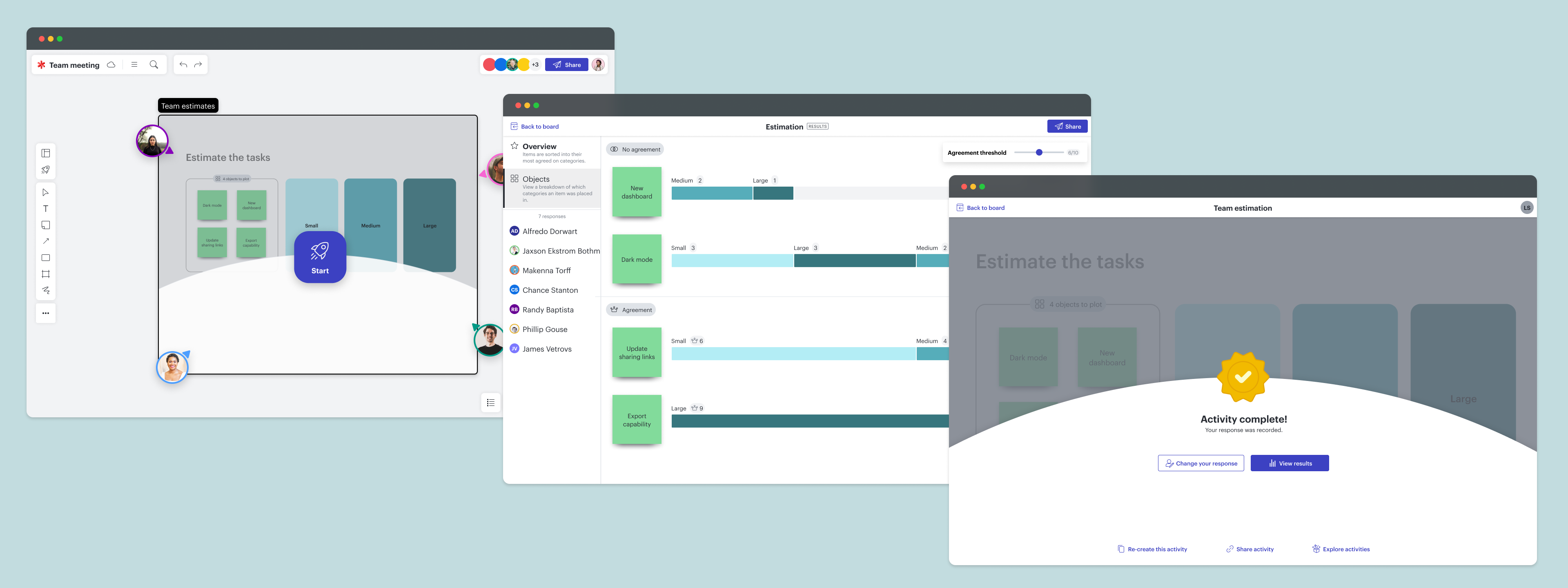
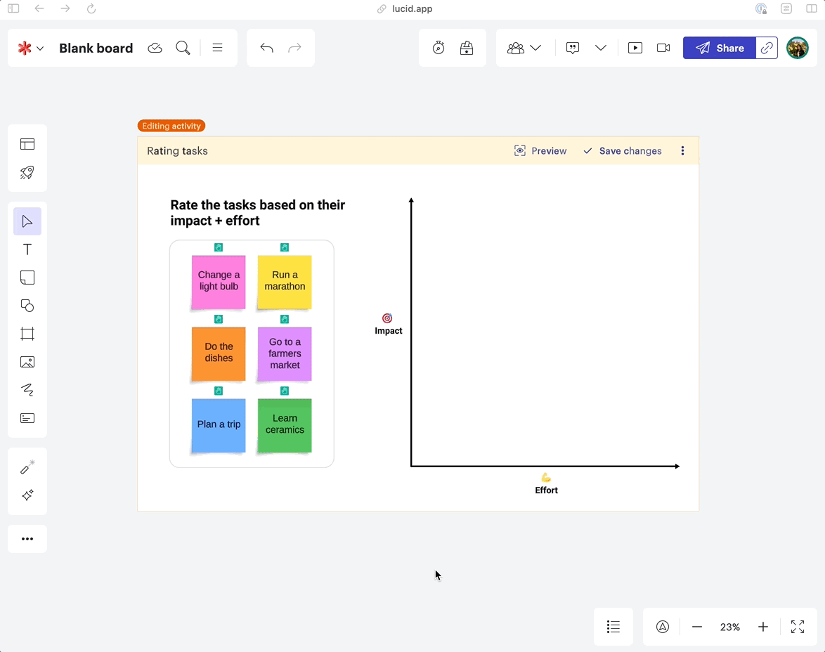
The on-canvas activity shape:
The final on-canvas activity shape has two states. We designed an 'edit mode' to allow the activity to be open to other content on the canvas. In this example, the 6 sticky notes are dragged into the activity shape while in edit mode. Each item gets a green hand hint to denote that it'll be interactive for participants in the activity.
Once a user is done editing, they can save their changes, closing the activity. The activity now shows an overlay with a rocket-ship start button, allowing anyone on the whiteboard to participate.
Previous interview insight → ⚓️ Anchoring design requirement
In our initial user research, we learned that teams needed to gather feedback on existing content already on their board; deciding on Jira card estimates or creating a priority of sticky note ideas. This led to our design solution of a two-state survey shape. In the editing state, collaborators can add any canvas content-- a sticky note, square, or card.
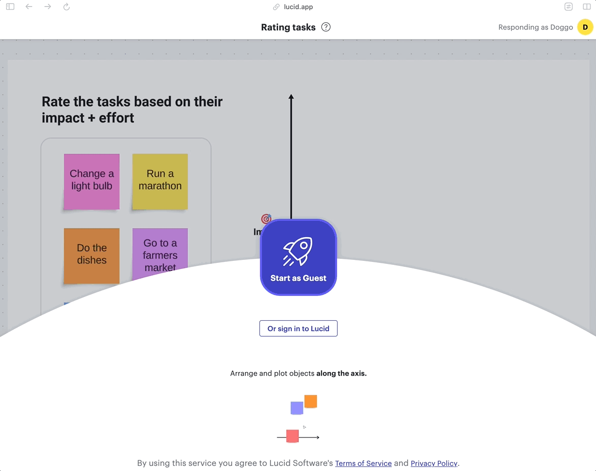
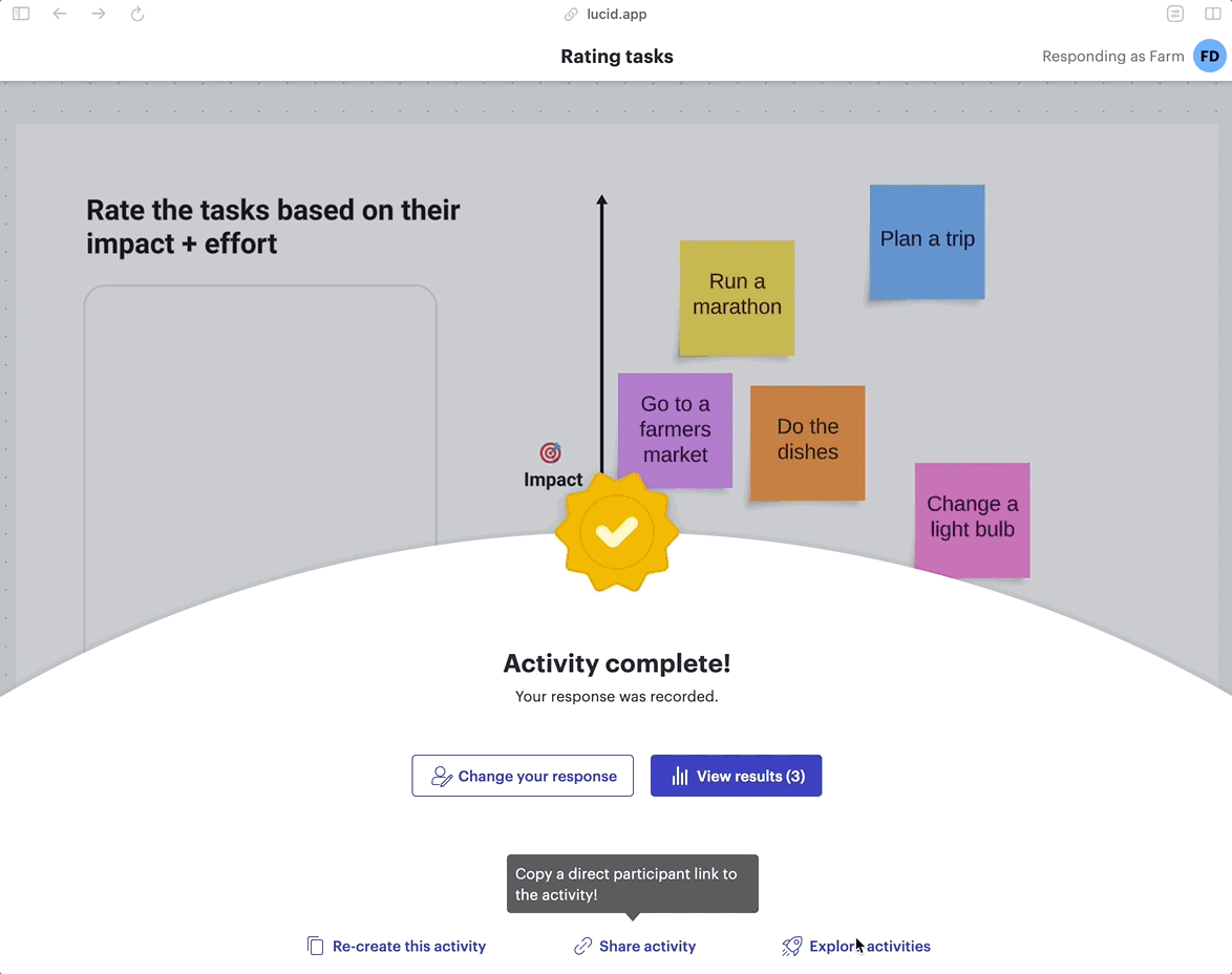
Participating in an activity:
I designed key pieces of the participation experience as users take a Visual Activity. Once users enter an activity, they’re brought into their mini-canvas, taking up their whole screen. With the top right corner, participants can see their avatar and "Responding as.." to know they're in their own space.
Participants can find interactive objects by hovering over them and seeing objects react. Each collaborator plots objects on the activity and then can submit their response, getting a confirmation of their response.
Previous interaction insight → ⚓️ Anchoring design requirement
From interaction testing internally, we saw that users were familiar with the collaborative space on the canvas. Our participant experience now confirms that each user is in their own private view to respond to the survey.
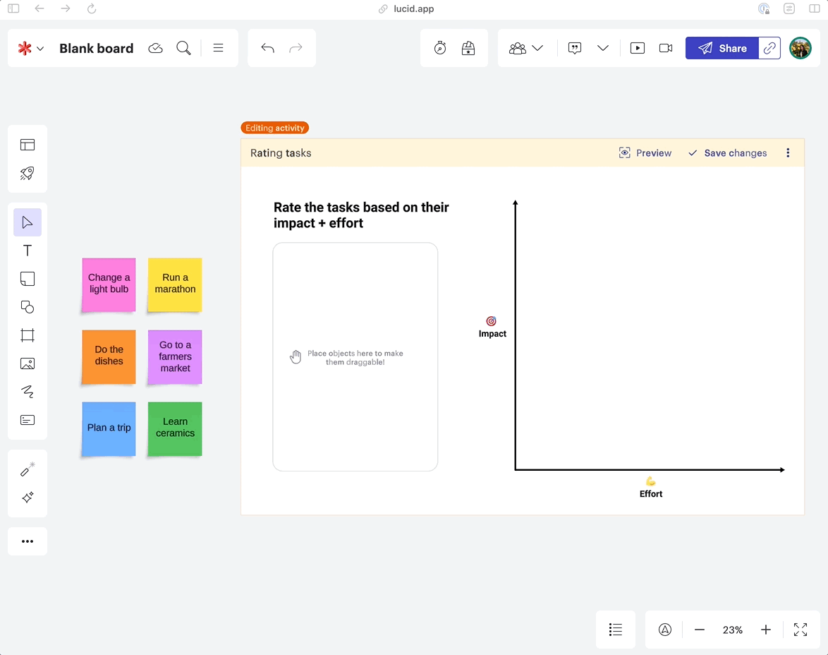
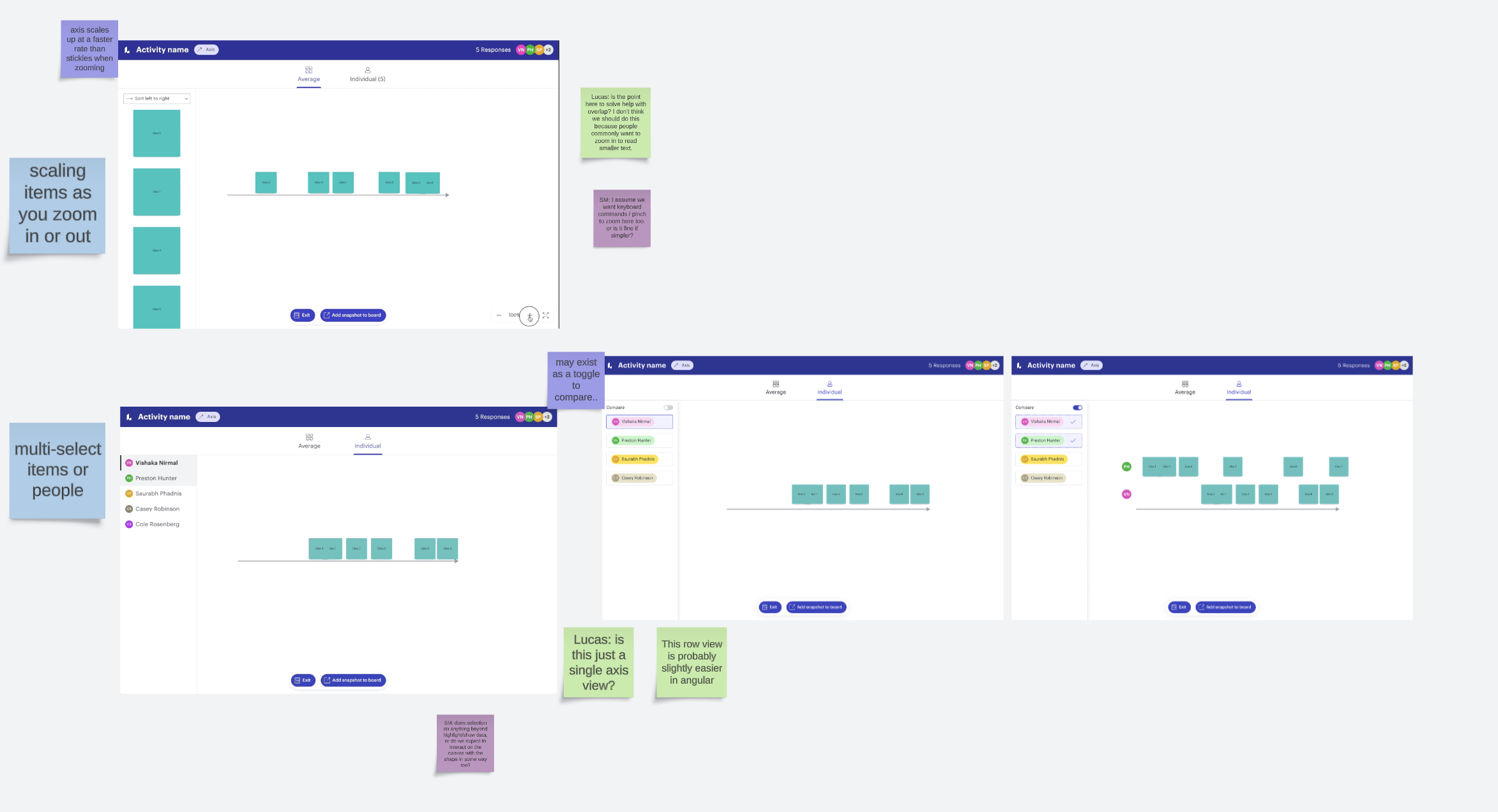
Results for an activity:
I designed the interactive data visualizations seen in results. In the example shown here, 3 respondents have taken this activity. On the average view, all responses are placed in a calculated position.
Hovering over each item showcases each collaborator's avatar, showing where they placed the item in relation to the average.
Previous user flow insight → ⚓️ Anchoring design requirement
Our user flow testing showed that users needed a digestible data visualization to see the team's responses. This led to the interactive solution, where multiple layers of data can be interacted with.
Development
In the early stages of this project, I often co-designed with engineers on my team. I used conceptual mocks to describe an ideal solution, and we could discuss an easy technical approach to get us there. This image is an example of the development collaboration I had with engineers, marking up my concept mocks.
Eventually, we transitioned to a more traditional handoff process. I worked to outline specs in Figma, and hand off designs through Jira tickets. In this example, I utilized annotations to help specify some of the design specs.
Reflections
Release
The final product allows teams to create, deploy, and analyze a visual survey. This new feature is available on all Lucidspark and Lucidchart boards.
We released Visual Activities to all Lucid users in May 2023. If you're interested in trying it out, you can get started here.
Parting thoughts
This year-long project was such a large learning space for me. Getting to lead out large design epics, build up product strategy, and work closely with engineering to build coded prototypes was a lot of fun.
What I learned most throughout this process was the benefits of quick iteration. We had a lot of ideas, got to test them out quickly, and saw what stuck. This helped us to build a new feature and innovative paradigm for gathering feedback in only a year! This thinking was presented by my teammate, Preston Hunter at Front Utah: How to build a feedback system to test 10 ideas a week
Long story short, I design creative and purposeful solutions.
If you're looking to create exciting work with me, find me at heyvishaka@gmail.com